Background Radiation Environment
Natural Background Radiation is all around us, and we are never away from this type of radiation. It consists of several types by source: 1) In the Air. A major source of natural radiation is airborne radon, especially in areas with crystalline bedrock and thin soils or in house basements that have been dug into bedrock. 2) Cosmic Radiation. The earth is constantly being bombarded from outer space with positively charged ions of lighter elements. These particles collide with the earth's atmosphere and cause a rain of high-velocity muons with sufficient energy to reach the ground. Areas at higher elevations receive greater doses of cosmic radiation. 3) Radionuclides in the soil or bedrock including potassium, uranium and thorium and their decay products. 4) The food we eat! Humans require a variety of minerals in our diets including potassium and carbon which have radioactive isotopes. All these sources contribute to the natural background in varying amounts at various places.
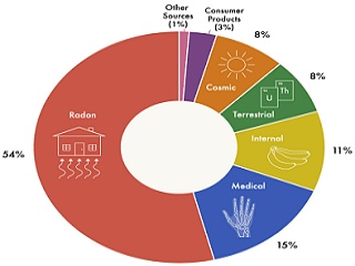
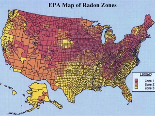 The pie chart (upper right, from a Duke University) illustrates the above discussion with a couple extra categories thrown in, although medical radiation is not really a part of the natural background. Note that Radon is by far the largest source of background radiation. The map at left from the EPA shows regions (by county) in the United States colored for general Radon levels with red being highest and yellow lowest. Note that southeast Texas is low generally in Radon and thus may not be a significant player in my background counting.
The first thing one may do with a Geiger counter, assuming they did not include a radioactive source with the instrument, will be to measure the local background. This is something that ought to be done regardless of what, or how many sources one may have ready to work with. Any data and measurements one measures will include this background so it is worth knowing beforehand. It is also a good way to understand that instrument and what it shows, beyond making those sweet required clicks.
Note: I wish to state from the outset that all my measurements are in radiation counts per minute. This is a common, but not a standard unit. CPM is device-specific and is related to the sensitivity of the counter, the size of the collecting area, and other factors. The manufacturer provides the following calibration:
        Cs137                   Co60
        mR/hr       uSv/hr      mR/hr       uSv/hr
GM-45   0.000333    0.00333     0.000277    0.00277
Multiply the CPM count by the appropriate factor to get the desired unit. I report all my data in the native CPM as I am uncomfortable with such calibrations.
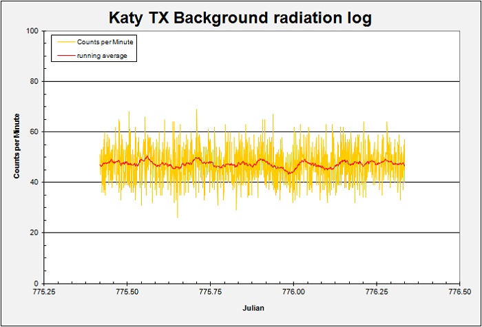
The following plot is from an early 2003 background check made shortly after receiving my counter. I plot the output in CPM (counts per minute), the standard for reporting, as well as show a running average. The data runs for almost one hour and the instrument reports the data each minute. That is, each data point is the product of one minute collection. The raw data looks messy and fairly random, expected with radiation data, in fact some random-number generators may take radiation background data as truly random seed values for their product.
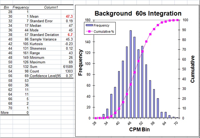
Looking into the background log a bit more deeply with some high-level statistics reveals that this data set has a mean value of 47.3 CPM, but a range from 26 to 69 CPM. The standard deviation is 6.7 CPM and the proper characterization is to say the data has "47.3 plus or minus 6.7 CPM". A histogram of the data reveals a lovely "bell-shaped" distribution of values. This is the daily record for one hour of one day. Get used to the statistics; it is the way one looks at radiation!
The following plot includes the full background characterization study, a series of 70 runs over a period of one year. Yes, I tend to conduct my experiments over extended periods. Each daily run extended over 2 to 17 hours of collection so the data is considerably reduced. In the plot I have each daily average CPM along with the 6.7 CPM "error bars". It should be apparent that the error bars do not really characterize the actual data being plotted. Were it so, significantly more scatter, as in the original plot, would be expected. A visual inspection suggests that the local background averages somewhere around 45 to 46 CPM. Variation does not seem to be more than 2 or 3 CPM. Also, it appears that the background increased about 1 CPM in the second half of the year. What is happening?
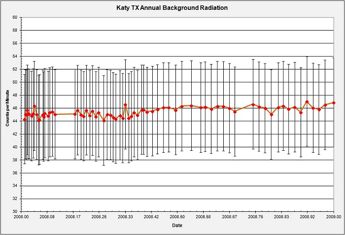
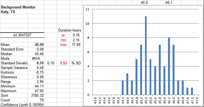
A statistical view of the annual background plot appears below. The histogram is not the lovely bell-shaped curve seen originally, but looks rather like two superimposed bell-shaped curves, one for the first half of the year with a mean about 45, and another for the second half with a mean of 46 or so. That is, what one sees in the plot is exactly correct. The data certainly possess sufficient precision to note such a small change from early to late. In fact the standard deviation now is only 0.7 CPM. Why the difference? How did the improvement occur?
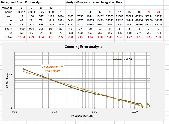
To know what my data limits are, I took all the annual data and worked it into an "Error Analysis" in order to see how the data precision increased, and hopefully find a mathematical relationship that I can use to predict precision. Note that in the original plot each data point shows the sum of radiation counts over a one-minute interval, that is, the data has a 1 minute integration time. There is no averaging as the report is in its native counts per minute. For most of my counting work I typically integrate over a 5-minute interval and report the average. This should improve the precision, and so it does. The plot below is complicated, but in it I have taken all the data from all the runs and grouped them into different integration intervals ranging from one minute (0.017 h) to 24 hours. I was able to put together nearly 5000 groups of one-minute data, but only 3 24-hour runs made especially for this analysis. I then took the mean and standard deviation of the grouped data in terms of total counts.
In order to express the "tightness" of the bell-curves for each integration interval, an expression of the precision of the group, I calculated the value standard deviation (SD) percent of the mean. For a 1-minute integration, the SD is fully 15% of the mean value and the bell curve is wide. At 24 hours the SD is only 1.1% of the mean, a very tight curve. Note here that I am taking a standard deviation on only 3 data points! BAD statistics, but oh well. Plotting the SD%Mean against the Integration interval shows increasing precision (decreasing SD%M) with increasing integration time. On a log-log plot the trend is nearly linear. I assume the variance from perfect linearity is due to the decreasing number of data groups as the integration time becomes large. With fewer groups to work with, the SD calculation is less accurate. As mentionned before, at 24 hours I only had 3 groups with which to calculate a SD.
My average daily run length was just under 10 hours, so the SD%M is about 1.5 percent. 1.5% of a 45 CPM mean is only 0.67 CPM. It is to be expected that the increase from 45 CPM early in the year to 46 CPM later is clearly discernible in the plot, and the big 6.7 CPM error bars are fiction.
So, what in fact DID cause that rise in background in the course of the year? The answer can fall into two domains, either it is due to an instrument deviation, or the local background changed in some way. With inexpensive hobby instrumentation one must always be suspicious of the machine. But, in this case the counter functioned flawlessly.
During the course of the year while I was working the background study, I was also acquiring some radioactive mineral and other sources with which to conduct further work. The samples were stored in the same room about 6 to 10 ft from the counter location. As can be seen from the chart, the samples began to arrive in late April and May and were all stocked and ready by June. No secrets hidden from the counter!
The following section takes a look at my sample sources and discusses a bit the types of isotopes involved.
kjs 2017
Return to Lab..
Back to Main....